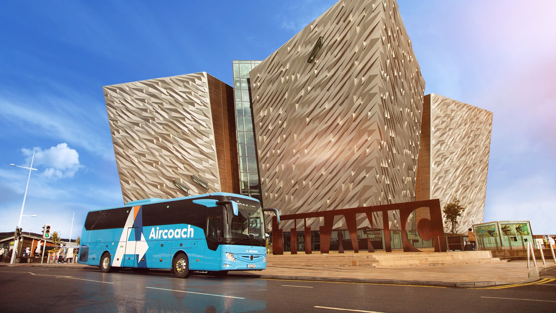
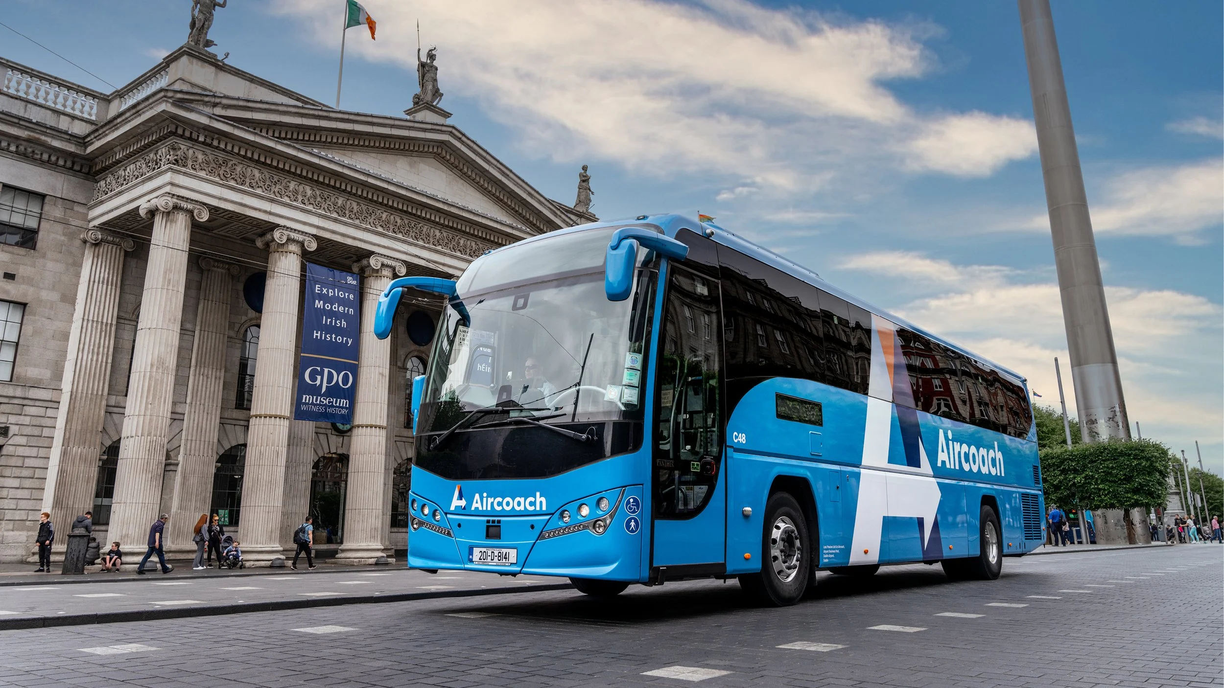
Aircoach
Aircoach had the same logo for over 20 years, and this logo was becoming an issue as it was developed without brand guidelines. It was outdated and restrictive in what formats it could be applied to, so Aircoach approached us to develop a new visual identity.
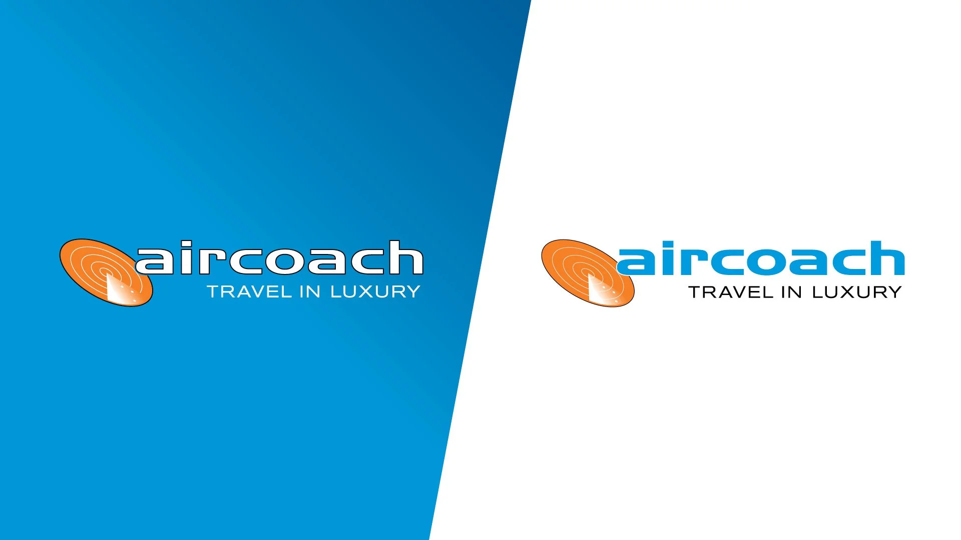
Original logo
When developing the new logo the only restriction was that we had to retain the existing colour palette, as the blue bus had become synonymous with the brand.
The logo mark is a stylised and layered “A”. The arrow in the logo represents movement and guides the viewers eye to the Aircoach word mark. The brand’s existing colour palette was complemented by a premium navy blue for depth. Together the sky blue, navy, white and orange represent the sky throughout the day and night, symbolising the 24 hour service Aircoach provide.
Comprehensive brand guidelines were developed to support and future-proof the logo.
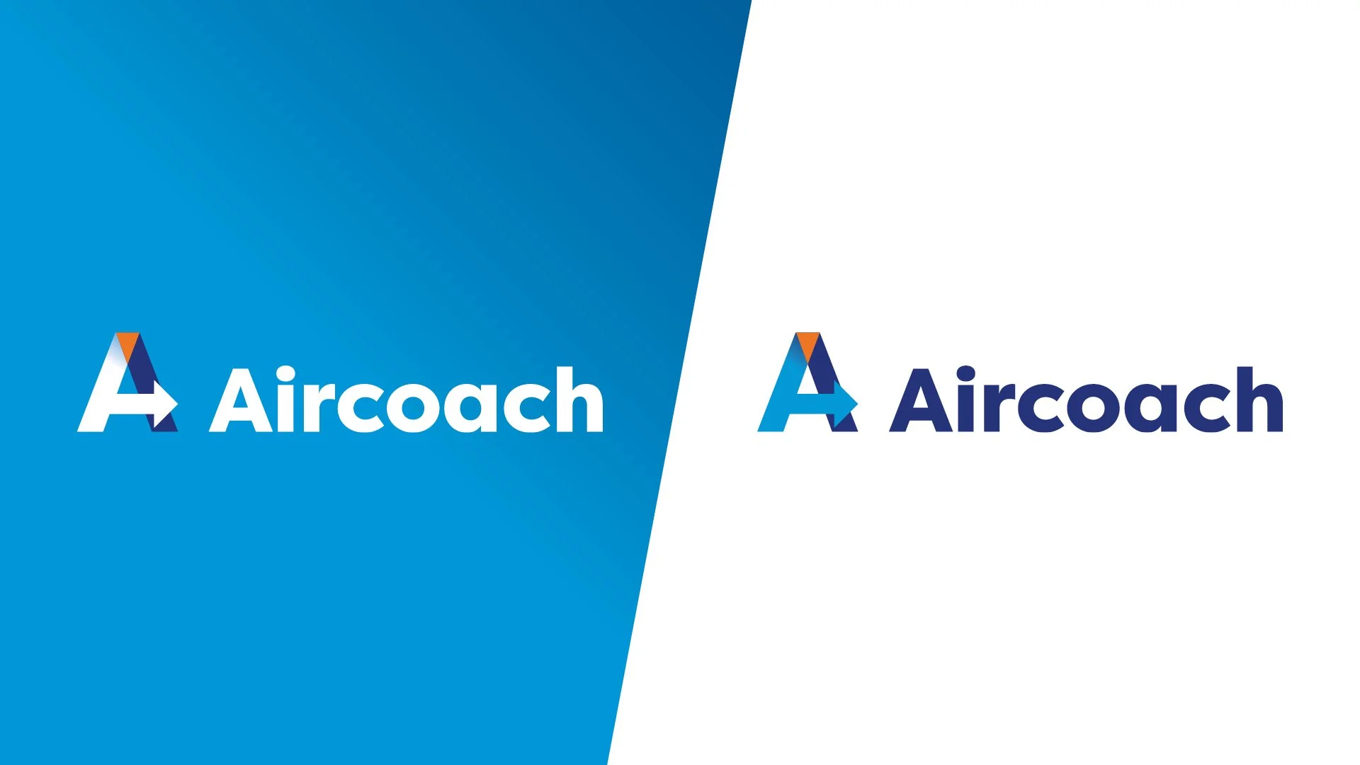
Redesigned logo
The enhanced visibility provided by the new branding has proven to be very impactful for Aircoach, with walk-up customers at Dublin Airport increasing by over 20% since its introduction. Online orders has also increased by 12%. Consumer research has indicated that new branding has been a major factor in passengers choosing Aircoach over their competitors.

The new branding has been very well received by Aircoach’s parent company, First Group, and has lead to them increasing marketing investment in Aircoach now it is a distinct brand. As part of this increased investment, we developed a full branding suite for Dublin Airport Terminal 1 that was designed to guide passengers from the arrival gate through the airport, and to the Aircoach Terminal.
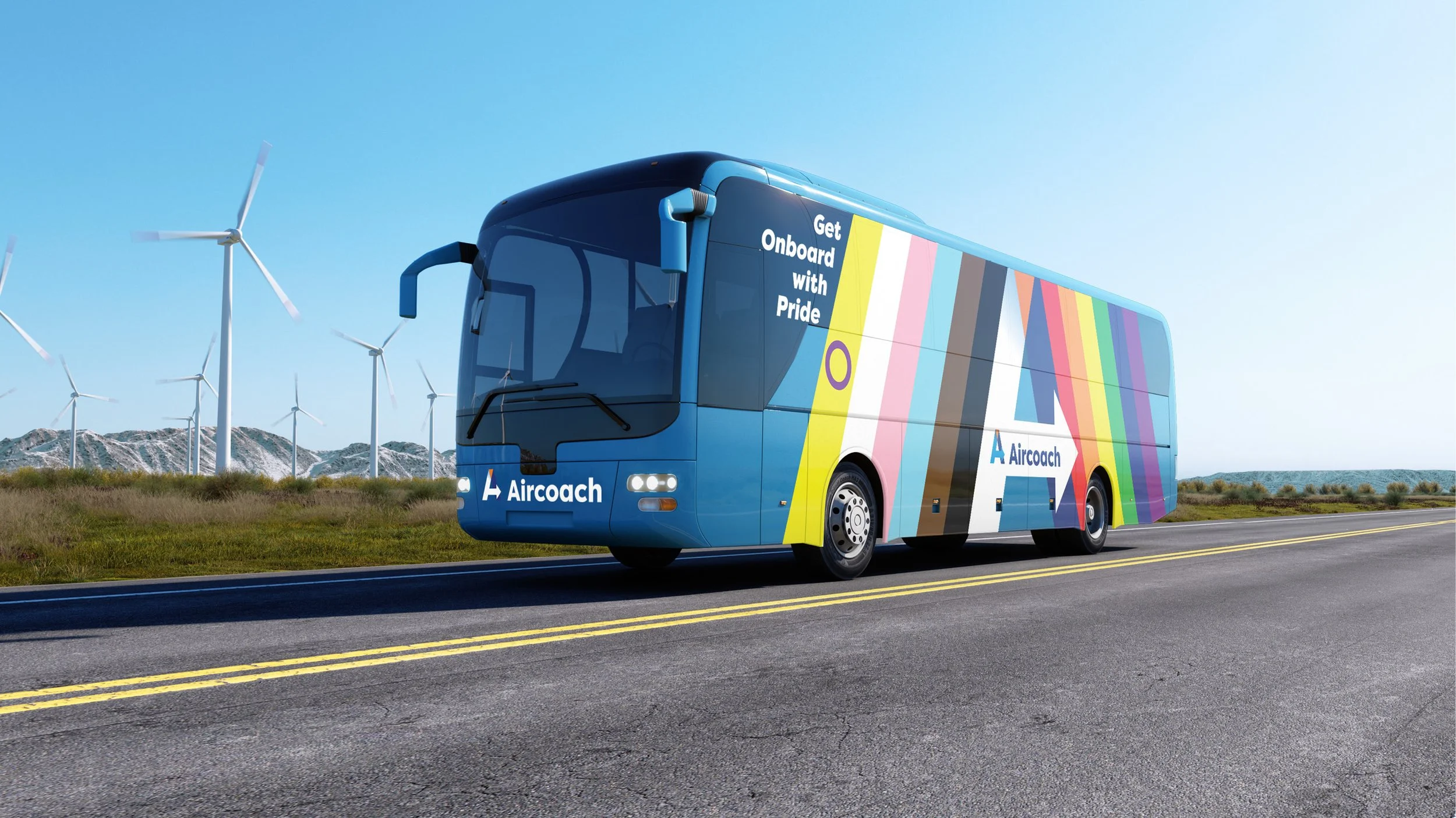
2024 marked the launch of Aircoach’s partnership with Dublin Pride and the creation of a dedicated pride coach with custom livery.